Monday, April 30, 2012

Artist Statement

Photographing people offers the viewer a range of different emotions and different perspectives. I have always been interested in photographing the emotions of people and the spontaneity of expression in people’s faces. So much can be revealed through the look on a person’s face and I like the power that can be captured through a photograph of a person. Annie Leibovitz is one of my favorite photographers of all time. I really enjoy all of her work and the varying shoots that she worked on. Through her connection with her subjects she was able to capture honest and real images of the people she was photographing. Her powerful images that sparked controversy and conversation are proof that her work created an impact that was recognizable and appreciated. Dorothea Lange is also an inspiration to me because her work captures so much feeling. She lived during the depression and her work captures the turmoil and emotion that existed during that period. Her photograph of the Migrant Mother is one of the most powerful images because of the feeling of desperation and sadness that is portrayed through the women’s eyes. Overall, I am very inspired by the work of all portrait photographers because there is something to learn and experience from every portrait photograph. 


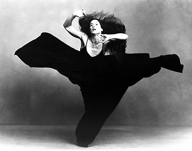
I picked the theme of emotion because emotion is central to almost any picture. Also, I really just enjoy taking pictures of people and capturing them during natural or spontaneous moments. My goal was to portray some kind of emotion through every image that I have selected.

Pre-Production
My preparation before my photo shoot with Monica as my model involved brainstorming what emotions we wanted to portray and how we might go about portraying them. In the end, however, we found that we couldn’t force too much emotion. Most of the emotions pictured in this presentation came from honest feelings.

Production
            The production took awhile because we found it was a lot harder than expected to portray different emotions. We decided natural emotions were better for the presentation so we spent a lot of time talking and snapping pictures when natural emotions became easier to portray. There were a lot of pictures taken during production because it was difficult to capture a good shot that also contained a real feeling or emotion. Also, the camera was not fully charged so we had to take breaks to charge the camera, but these breaks offered us the time to really think about the pictures we had taken and how to improve them. The location of all the pictures is in the hallway of the dorms. We did this so that there is a sense of repetition and unity among all the pictures. We figured that a different location for every picture would just be a distracting element considering the whole point of the project was to simply capture raw emotion. This means that the background does not really matter so we figured a white tiled wall would be the simplest and least distracting background. The pictures were taken in the middle of the day, which offered us plenty of natural light from the window in the hallway. Lastly, the only equipment used was my digital Sony camera. 

Post-Production
            Looking back at the images now I am not only happy that Monica is a great model who can express emotions very well on her face, but I am also very satisfied with the emotions we were able to capture. Although I wish we had better acting abilities and could have captured a greater array of emotions, overall I think we did a good job and ended up with a lot of photographs to choose from. Our original idea changed from us photographing different subjects in different locations to just photographing each other. I like our shift in ideas, however, because different subjects could have distracted the viewer from the main theme of our project: emotion. Our project is not about different people it is supposed to be all about different emotions.  By keeping our subjects and location simple we were better able to convey the idea of emotion. To improve our work I think I would have liked to have been able to take some kind of acting class or been able to capture a raw emotion right as it was actually happening. This is a lot easier said than done. Most people do not go and grab their camera when their friend is crying or feeling depressed so capturing true emotion would have been very difficult although I wish I could have been able to do that. However, everyone portrays emotions on their faces at all times during the day so I think our project was successful in capturing the emotions that we could at the moment. Overall, I am satisfied with our project. I really enjoy portrait photography so this project of capturing emotion is not over yet for me. 

Production Journal


Emotion is a strong word with a variety of expressions. Being able to capture emotion and tell a story through the feeling captured in a photograph is a form of art. The ability for the viewer to feel, understand, and relate to the emotion captured in an image is every photographer’s goal. My objective for this project was to do the best that I could to capture emotion through black and white images. Using Monica as my model, I attempted portrait photography through the exploration of different angles and lighting. My goal was to be able to capture some kind of emotion that could be understood by the viewer. The tone that I was trying to portray through the black and white images was one of pure feeling and emotion. I wanted the focus of my photography to be the face or the eyes of Monica and the body language she was trying to portray. Our faces reveal the emotion and our body language tells the story behind the emotion and this is why most of my images are not simply just of the face.

Pre-Production:
            My original idea in regards to this project was to capture emotion using various models in differing locations. I wanted to capture my friend on the Diving team before he was about to do a dive, my friend and her boyfriend glancing into each others eyes, two of my friends embracing, and a person becoming frustrated while studying in the library. These were some of my original ideas. Although the overall plan has changed, the goal of my project has remained the same. Emotion is the centerpiece of my project and I can only hope that this shines through in my work. I decided to choose the simpler route because I felt that differing actions and emotions would only distract from my main goal—capturing emotion. One person can experience and display many different emotions and I wanted to capture that through the use of one model and one location.

Production:
            Capturing real emotion is a difficult thing to do. I carried out my plan by taking a plethora of pictures and never becoming frustrated with the difficulty level of the subject of emotion. I constantly tried (and often failed) taking pictures from different angles and guiding Monica to make different faces and emit different emotions. Although this was difficult, one of the hardest parts of production was deciding which images were edited from the presentation and which images remained. Due to the magnitude of pictures that I captured, this was a difficult task. I then edited the pictures by making them black and white and either lightening or darkening the image. Since there was plenty of sunlight during production, editing was not that difficult. I think what worked was making the images black and white but what could use more work is my Photoshop skills because I think the images could have been edited a bit more.

Post-Production:
            After completion of this project I learned that I have a real passion for portrait photography. It is simply more than finding a person and taking a picture of them. This project really proved to me how difficult it often times can be to capture a powerful image that grabs a viewer’s eye. By doing this project I had to force myself to think about the best way to capture feeling in an image and through this I learned that we display our emotions in more than just the face. It is safe to say I am no professional but this project has made me that much better at photography. If I could do this project over again I would experiment with different props and different lighting and see what other images I could come up with. Overall, I could have done more experimentation in my project. 

Emotion


Photo 1
This is one of my favorite pictures because it is more than the eyes that are portraying the emotion. Monica’s hands almost clawing at her face show a bit of frustration as well as sadness. There is use of symmetry in this piece because her nose divides the picture in half and on each side is a hand. This image is a close-up and it works well to capture the emotion because not much other body language is needed for the viewer to understand the overall feeling. 


Photo 2
This picture is an extreme close-up shot. Although her eyes are closed, the emotion can still be understood through the shape of her lips and the lines from her brow. There also is a sense of symmetry in this image because there is symmetry of her face. 


Photo 3
The focal point of this picture is Monica’s eyes. The frustration is clearly seen through the fixation of her eyes. The body language of grabbing at the hair also adds to the emotion. There is a feel to this photo even though nothing was cropped because only parts of her body are seen and the photo is not balanced or symmetrical on both sides.


Photo 4
The focus on Monica’s face as opposed to her hands is key to this photograph. The viewer, although the hand is in the forefront, is drawn to Monica’s face and to the emotion that her eyes portray. There is a deep depth of field because the hand, which is closer, is not seen in sharp focus while Monica’s face, farther away, is more in focus.

Photo 5
This image is taken at a different angle than the other pictures thus far. I am at a higher angle as opposed to straight on. This gives the viewer the feeling that Monica is looking at something in the distance and it also offers a different view of her face. There is happiness in this photograph even though her smile is not as clearly evident and the viewer cannot directly see into her eyes. 
Photo 6
This photograph has more of a classic portrait feel to it then the other images but the emotion is still evident. The tilted head and direct view of the eyes adds to the overall theme of the image. Her shoulder and dress is more out of focus as compared to her face and hand.
Photo 7
This is the only image in this project that shows Monica’s entire body. Her body position adds to the overall feeling of the entire photograph. The door in the background is almost a visual frame because it directs the eye and attention down towards Monica. There is also some symmetry above and below Monica with the empty space. Monica is centered in between the top and the bottom of this image but is not centered when just looking at it from left to right. 
Photo 8
The body language in this photograph really adds to the emotion portrayed. Monica’s face is not centered in this image and the rule of thirds is applied because her face occurs in the upper third of the image. The shape of her arm really stands out in this picture for me and I really like the overall composition of this image.
Photo 9
The body language also shines through in this image as well. The position of her hands and the gesture she is making signals to the viewer what emotion she is trying to portray. Her face is not entirely centered in this image and the empty space in front of her adds some depth to the picture. 
Photo 10
I experimented with the idea of tilting the camera to create a different angle with this image. This kind of skewed presentation adds a little more to this picture as compared to if I just held the camera straight on. Once again, I made sure to not have Monica completely centered in this picture.
Photo 11
This picture has the most emotion portrayed in it by far. The motion-blur that is portrayed adds movement to the photograph even though it makes her a bit out of focus. Monica is more centered in this photograph.
Photo 12
I like how this photograph clearly has a lot of emotion in it even though the only thing that is visible in this image is her face. She once again is not centered in this image because her face is not in the center of the image and there is a cropped feel since part of her hair on the left side is not visible.
Photo 13
This photo emits the feeling of sadness. The lines around her mouth and the position of her eyes indicate this to the viewer. I also like how she is looking down towards the open space that is at the right side of the image. The viewer almost follows her eyesight towards this empty space and leaves you wondering what she is looking at or thinking of.
Photo 14
I like how only one eye is visible in this picture. Just like the last image, her eye draws the viewer towards the white space. The body language of her hand covering her mouth adds extra feeling to the image. I also like the unintentional focus on the ring. Also, the background is so out of focus that you cannot tell that it is a tiled wall. 
Photo 15
The point of view of this shot is different from all the other shots so far. The above the head view gives the viewer a different angle and different perspective. Monica is not at all centered in this image but the empty space doesn’t appear to take away from the emotion portrayed. This emotion is clearly happiness.
Photo 16
This is also an above the head point of view. The body language of Monica biting her tongue and squinting her eyes gives off the emotion of excitement and happiness. Her lower body is out of focus while her head is fully in focus. The light shining in on her face adds some brightness to the picture.


Monday, April 9, 2012

Annie Leibovitz: Life Through a Lens


If you are at all interested in photography, than there is no doubt that you have at least heard the name Annie Leibovitz. She is known for taking very famous pictures of very famous people including George Clooney, Hillary Clinton, John Lennon, Arnold Schwarzenegger and Michael Jackson. She is famous for humanizing the people she takes pictures of and for taking risks with her work. She has shot for magazines such as Vanity Fair, Vogue, and Rolling Stone.

This film about Annie really inspired me as well as taught me about the beauty of photography and about what it takes to get a good shot. Annie’s photographs do more than just capture a moment in time; they tell a story. She describes her photographs as “a portrait of a moment” and there really is no better way of describing it. Each of her pictures has meaning behind it. Sometimes photography can be thought of as just simply pointing a camera at a subject and pressing a button, but that is a terribly mistaken misconception. What is interesting about Annie, and is one of the reasons why she is as famous as she is, is because she gets to know and understand her subjects so that they feel comfortable around her. This intimacy with the subjects allows her to become a part of the scene and to truly capture the emotions and personality of the subject. This kind of intimacy is more than just taking pictures. Her pictures are about capturing a bit of the story of that person. That is why her images are so captivating because there is emotion and power in her images that could not be created without that connection between photographer and subject.

Another thing that is very interesting about Annie is the influence from other photographers that she modeled her own work on. She was very influenced by Barbara Morgan’s photographs of dance and even modeled some of her own dance shots off of her work. She researched the work of other artists and used their work as inspiration for her own shots.


The top image was taken by Barbara Morgan and the bottom image was taken by Annie. Both of these shots have the same point of view however Annie’s shot of the dancer has an aspect of symmetry since the dress comes up on both sides of the dancer and almost frames the dancer in the center of the shot. Both images capture the movement of the dancers through the flows and creases of the dresses and the positions of the dancers.

One of the most humbling moments during the film was when Annie was discussing her faults with one of her photo shoots. It was refreshing to hear from someone who is so famous for her photographs to admit to not always being a professional and for discussing her own failures and setbacks. She said something about the photo shoot that she felt she did not do so well on that really interested me. She said that it is important to, “take your photo to another place—make it meaningful.” This is important because a picture is average unless there is power behind the image. She emphasized taking a picture and bringing it to the next level. When discussing the faults with one of her photo shoots she mentioned that she had subjects but never made them do anything other than just stand in line for the picture. She realized looking back that she could have taken her picture to the next level by using her subjects to create a truly powerful image.

There are so many powerful and moving photographs that Annie Leibovitz has taken and I wish I could include them all here. Instead, I just chose a few of my favorite shots.


This photograph, although humorous, has a strong message behind it. Annie’s vision behind this picture was of Whoopi emerging from the “white” of the milk just as Whoopi in real life had emerged as a black woman in a white world. I really like the point of view of this photograph. By capturing the image from a viewpoint of being above Whoopi we get a full view of her emerging from the milk. If the shot were taken straight on from the side of the bathtub, the message would not be conveyed to the viewer because the full scene would not be pictured.


This photograph is extremely powerful and was also very controversial. This is a portrait of Demi Moore but it is not the average portrait. The portrait is a straightforward shot, which is average for a portrait, but the complete nudity of Demi while pregnant creates a very memorable image.


This shot is really moving because although the Obama family does not appear to be posing or ready for the shot, there is a natural feeling of love and connection. Annie catches the family in an honest moment and I think that is what she does best.


Scavenger Hunt Video

The Chase

Monday, March 19, 2012

Doritos Commercial Review

Doritos commercials are some of my favorite commercials. They not only are good for a great laugh, but they visually present the product really well through different camera angles and shots. This ad especially had a few of the concepts that are discussed in The Bare Bones Camera Course for Film and Video.

This commercial starts off with a close-up shot of a man's hand knocking on a door. The shot is wide enough to understand the environment of the situation. Just from the first shot of the advertisement, the audience is made aware that a man with flowers is knocking on a house door. The shot duration is really quick because we become aware of our surroundings right away and the advertisers do not want to waste any unnecessary time.


The next shot is of a lady opening the door and accepting the flowers with a smile and a "thank you". The camera stays on her face as she accepts the flowers without switching over to the man's face. This ad could be improved if there was some kind of cutaway to the man's face as the lady was happily receiving the flowers because it would have been nice to see his expression.


The next scene is cutting on the action because it is a smooth transition of one shot to the next where the action is the same. In one shot the lady says "thank you" and in the next shot she says "have a seat". It is all one continuous action, but it is presented in two shots. The transition of shots goes from a close-up of the lady opening the door, to a medium shot of the man and the woman standing in her house where the background is her yellow room and only half of their bodies are seen. Also, this is the first time that the man steps into the camera's frame.


In the next scene, there is a quick shot of the woman's lower body as she is walking away. This shot is supposed to be from the man's perspective. The duration of the shot is only a few seconds but it gets the message across. The next shot is a medium shot of a little kid with a game boy controller in his hand.   The boy is not positioned in the middle of the screen, but rather follows the Rule of Thirds and is positioned more to the side. The duration of this shot is very fast.


The next shot is a cutaway of the boy's remote controller which then falls to the ground as the boy drops it. The shot is a close-up because all that is viewed in the shot is the remote controller.


Then the advertising of the Doritos comes into play with a close-up shot of a bowl of Doritos. The audience is reminded what this whole video is about as the focus of the video becomes the bowl of Doritos. The shot is a straight-on view of the bowl. Although randomly positioned in the advertisement, it is well placed because it does a good job of reminding the audience of what the focus of the video is supposed to be about. 


As the older man comes and sits next to the young boy, there are several scene changes that occur. If there was one continual shot, the audience would quickly lose interest in the scene because their eyes would be looking at the same thing. When the scene changes occur, the audience becomes more drawn into the action of the scene. This video does a great job of varying the camera angles and shots and keeping the scene interesting while flowing nicely. 


This video is short but is able to tell a funny story with great transitions. Although the video is only 34 seconds long, it is a good example of how different scenes can be only a few seconds long and how transitions can be used often to better tell a story. Plus, it is a funny and very cute video!

http://www.youtube.com/watch?v=4rsEnwKrsvc

Wednesday, March 7, 2012

Product Placement

Product placement is a type of subliminal or hidden advertising where businesses strategically place their products in TV shows, movies, and video games so they appear as if they are a part of a story's natural environment. Chapter 6 mentions that as more and more people find ways to skip ads on the television, this forces advertisers to get creative with their advertisements. This creativity led to product placement and quite frankly, it is a brilliant idea. Media critic Jeff Smith explains why it is a smart move by stating, "Product placement is one of the ways to reach a captive audience. If you work your product into a TV show or film, it's impossible for the viewer to zap it out." This makes sense because if a captive audience is watching a film where a drink is being subliminally advertised, that audience is going to be much more likely to purchase that drink later on because the drink will be fresh in their minds.

Chapter 6 even mentions the use of digital technology to place products into old television shows. The amount of technology that is available for use today can make any kind of product placement possible. While this is a good thing for advertisers, it does bring about some controversy when answering the question, how much is too much? Product placement is the advertising of the future and is a great way for businesses to advertise their products in ways that really work, but it can get too invasive and become a distraction for the audience. Product placement has become so widespread that even the sitcom 30 Rock makes fun of it in a scene where they talk about Snapple and then show a Snapple advertisement right afterwards. Luckily, as chapter 6 mentions, there are concerned viewers out there who are willing to protest invasive and distracting product placement that they believe goes too far.

Although product placement has its controversies, in the end it is a marketing tool that works. If you really look, they are everywhere. Little did you know that by watching TV, you are being subliminally persuaded to purchase a product.


Product placement is everywhere! If a product name is shown, that means someone paid for it to be there. 

Monday, February 27, 2012

Intermediate Photoshop class


This is just an image that I created in the New Media Center's class for Intermediate Photoshop.

Fresh

Myself, Meredith, Monica, and Evan had to come up with 10 images that represent the word "fresh". As a group, we decided to each take 3 pictures and then we would all meet and discuss which ones we liked the best. I feel like this way of setting up the group project really worked for us because we individually got the chance to take our own pictures and explore with the concepts in "Idea Index" but then we also came together as a group to discuss the images that we took. I think that what didn't work (or did work depending on how you view it) as a group is that we did not really have similar ideas of "fresh" so the theme of our pictures seem a little different. I guess the only thing I would do differently is discuss beforehand what we think "fresh" to be and then decide what kinds of pictures to take. Although this is the case and our pictures are very different, I really liked how the finished project shows a mixed range of ideas and creativity from different people. So even though we could have been a bit more organized, I think that it worked in our favor.

The most important thing I discovered through this group project is that one word can mean so many different things. We chose the word "fresh" because we thought it would be so easy to find things that the word represents. Turns out, each of us struggled a little bit to discover "fresh" things. We each went out and found very different things that represent "fresh" and captured them in different ways.


This is one of the images that I took to capture the word "fresh". This image has a shallow depth of field because the watermelon is the only fruit that is in focus in this picture, while the other fruits are slightly out of focus. The black utensil almost directs the viewer's eye towards the fruit and leads the viewer to the center of the picture. The watermelon is not right in the center of the image. This off-center placement makes it possible for the viewer to be aware that there are other fruit options and this adds to the overall image.

There is also added emphasis on the watermelon due to the reflection of the light in the water. Sometimes reflections are not a good thing, but the reflected light works in this case because it adds to the location of the picture since the light shows that these fruits are displayed in a case for people to eat. The color of the fruit is very vivid and draws the viewer's eyes to the image. The color really makes the image pop. The red, green, and orange are all very solid and powerful colors in this image because they are the only colors that are present. Since there is no other color in the image, the viewer's eyes are naturally drawn to where the color is.

There is also a sense of repetition in this image due to the similar white trays that are holding the fruit that appear one after the other. Although the viewer cannot see the full length of the white trays, they are still aware that the trays are similar and that a pattern emerges from the repetition. This sense of repetition is important for an image because it attracts attention to the subject, conveys harmony, and can create patterns.

Thursday, February 23, 2012

Newseum Photograph


"Two Men With a Problem" by Paul Vathis

This photo of Kennedy and Eisenhower has a background story behind it that is depicted in this moment captured on film. This photo was taken after the Bay of Pigs invasion had failed and Kennedy was seeking advice from Eisenhower. Their bent heads, rigid postures, and contemplative figures express the mood of the photograph and of the moment in history. This photograph really draws in the viewer with the angle at which the photographer captured the subjects. The photographer could have easily placed Kennedy and Eisenhower in the center of the image but by setting them more to the left of the image, the audience gets a view of the cottage. The pathway that Kennedy and Eisenhower are walking on directs the viewer’s eyes to the cottage. The framing of the pathway keeps the viewer’s eye on the image’s main points of interest, which are Kennedy and Eisenhower and the cottage. The pathway directs the viewer’s eyes and keeps them from straying away from the images’ center points.
The photographer used a deep depth of field when capturing this image because the background of this photograph is kept in focus. If the photographer used a shallow depth of field then all that would be in focus would be Kennedy and Eisenhower. Although that might have been a decent photograph, the deep depth of field captures more than just the Presidents, but also the feel of the entire environment surrounding them. There is a sense of loneliness, peace, and quiet contemplation that would not have been captured as well if the background was not in focus.
What makes this image so powerful is the story behind the photograph and the honest feel that the photograph gives off to the viewers. Kennedy and Eisenhower did not pose for this image and that is what makes this photograph more real. In my opinion, this photographer managed to capture a compelling scene in history in an amazing photograph. I think the photographer managed to capture a story rather than just a moment in history and whatever their initial message was, they succeeded in relaying several messages through this image. I was initially attracted to this photograph because although it may not be as dramatic or compelling as some of the other images in the gallery, it has a story and a feel that is present even if we only see the backs of two men. 

Saturday, February 11, 2012

Object Assignment


There is a lot going on visually in this photo and that is partly the reason why I chose it. There is a cropped feel to the photo because the image is not capturing the entirety of the structure. Also, this object that I chose to photograph establishes a "natural" or almost rugged feeling or environment. This is especially because with the tennis courts in the background, the structure almost seems out of place. The structure that I chose to photograph is a collection of wood that is now built into a structure for a garden. The industrial feel results from the materials that are going to be built into something but are not yet.
This photo captures the shape of the wooden rectangle well. There are no unequal spaces in this photo. The rectangle almost dominates the entire image but other wooden structures make up the background. There is also a sense of unity among the different wooden structures because they are all piled on top of each other. The 5 lines behind the wooden structures draws the viewer's eyes downwards.


This image has some contrast in it between the industrial feel of the fence and wooden structures and the purple, green, and yellow paint that make the words "eggplant" and "herbs". The fence also acts as a transparent object because we are viewing the other wooden structures through the fence. The dead looking grass adds to the environment of the photograph. The point of view of this photograph is from the ground looking upward at the structure.


I decided on these wooden structures as my object for this photography assignment because these structures almost seemed misplaced compared to the scenery around it. I really liked the paint that listed things that will be growing in this structure but as of right now, there is nothing growing. The shapes created by the wooden structure also had a visual appeal that really draws the viewer into the photograph.

Sunday, February 5, 2012

Playing with Shadows


                 This image immediately grabs the viewer’s interest because of the shadow created from the reflection in the water but the lack of a person creating the shadow. The shoes added to the photo play with your imagination and make the shadow appear as if it is wearing the shoes. This is an interesting point of view that the photographer has captured. They could have easily taken a picture of a shadow with a person, but instead they played with their imagination and chose a different tactic. The shoes add to the overall theme of the shadow portrayed in the water. This juxtaposition of the shadow combined with grayscale and the shoes creates a bold image and makes for an interesting image. Juxtaposition is when colors, shapes, or ideas are combined in unexpected ways and I think that this image contains ideas that are not average or expected. This image is also symmetrical in a subtle way. If I divided the picture in half the two images would be about the same except for a few shadows of trees that appear on the left side. The image contains aspects of symmetry because it conveys notes of strength and order and it is easy for the eye to navigate to what the photographer wants you to see. The photographer also follows the rule about avoiding the middle ground or the horizon line. The shoes are not placed in the middle of the image but rather farther up in the image. This creates a better feel to the image and that it makes the shadow more centered. 


Thursday, January 19, 2012

Branding Assignment


Three concepts that are incorporated in this document are alignment, repetition, and contrast. The document is aligned because my name is lined up with the text box that lists American University and the blog link. Also, the text box that lists information about myself is lined up with my photographs. This document also lines up with vertical edges along both sides. The document shows repetition through the use of the colors purple and orange and the repeated purple border line. The document shows contrast through the differing color between the titles and the information and also the background and foreground colors are completely different.