
Tuesday, April 24, 2012

Monday, April 9, 2012
Annie Leibovitz: Life Through a Lens
If you are at all interested in photography, than there is
no doubt that you have at least heard the name Annie Leibovitz. She is known
for taking very famous pictures of very famous people including George Clooney,
Hillary Clinton, John Lennon, Arnold Schwarzenegger and Michael Jackson. She is
famous for humanizing the people she takes pictures of and for taking risks
with her work. She has shot for magazines such as Vanity Fair, Vogue, and
Rolling Stone.
This film about Annie really inspired me as well as taught
me about the beauty of photography and about what it takes to get a good shot. Annie’s
photographs do more than just capture a moment in time; they tell a story. She
describes her photographs as “a portrait of a moment” and there really is no
better way of describing it. Each of her pictures has meaning behind it.
Sometimes photography can be thought of as just simply pointing a camera at a
subject and pressing a button, but that is a terribly mistaken misconception. What
is interesting about Annie, and is one of the reasons why she is as famous as
she is, is because she gets to know and understand her subjects so that they feel
comfortable around her. This intimacy with the subjects allows her to become a
part of the scene and to truly capture the emotions and personality of the
subject. This kind of intimacy is more than just taking pictures. Her pictures are
about capturing a bit of the story of that person. That is why her images are
so captivating because there is emotion and power in her images that could not
be created without that connection between photographer and subject.
Another thing that is very interesting about Annie is the
influence from other photographers that she modeled her own work on. She was
very influenced by Barbara Morgan’s photographs of dance and even modeled some
of her own dance shots off of her work. She researched the work of other
artists and used their work as inspiration for her own shots.

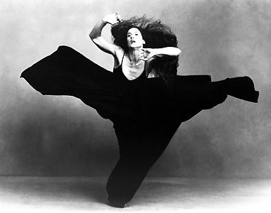
The top image was taken by Barbara Morgan and the bottom image was taken by Annie. Both of these shots have the same point of view however Annie’s shot of the dancer has an aspect of symmetry since the dress comes up on
both sides of the dancer and almost frames
the dancer in the center of the shot. Both images capture the movement of the
dancers through the flows and creases of the dresses and the positions of the
dancers.
One of the most humbling moments during the film was when
Annie was discussing her faults with one of her photo shoots. It was refreshing
to hear from someone who is so famous for her photographs to admit to not
always being a professional and for discussing her own failures and setbacks. She
said something about the photo shoot that she felt she did not do so well on
that really interested me. She said that it is important to, “take your photo
to another place—make it meaningful.” This is important because a picture is
average unless there is power behind the image. She emphasized taking a picture
and bringing it to the next level. When discussing the faults with one of her
photo shoots she mentioned that she had subjects but never made them do
anything other than just stand in line for the picture. She realized looking
back that she could have taken her picture to the next level by using her
subjects to create a truly powerful image.
There are so many powerful and moving photographs that Annie
Leibovitz has taken and I wish I could include them all here. Instead, I just
chose a few of my favorite shots.

This photograph, although humorous, has a strong message
behind it. Annie’s vision behind this picture was of Whoopi emerging from the
“white” of the milk just as Whoopi in real life had emerged as a black woman in
a white world. I really like the point
of view of this photograph. By capturing the image from a viewpoint of being above Whoopi we get
a full view of her emerging from the milk. If the shot were taken straight on
from the side of the bathtub, the message would not be conveyed to the viewer
because the full scene would not be pictured.

This photograph is extremely powerful and was also very controversial.
This is a portrait of Demi Moore but
it is not the average portrait. The portrait is a straightforward shot, which is average for a portrait, but the
complete nudity of Demi while pregnant creates a very memorable image.

This shot is really moving because although the Obama family
does not appear to be posing or ready for the shot, there is a natural feeling
of love and connection. Annie catches the family in an honest moment and I
think that is what she does best.
Monday, March 19, 2012
Doritos Commercial Review
Doritos commercials are some of my favorite commercials. They not only are good for a great laugh, but they visually present the product really well through different camera angles and shots. This ad especially had a few of the concepts that are discussed in The Bare Bones Camera Course for Film and Video.
This commercial starts off with a close-up shot of a man's hand knocking on a door. The shot is wide enough to understand the environment of the situation. Just from the first shot of the advertisement, the audience is made aware that a man with flowers is knocking on a house door. The shot duration is really quick because we become aware of our surroundings right away and the advertisers do not want to waste any unnecessary time.


The next scene is cutting on the action because it is a smooth transition of one shot to the next where the action is the same. In one shot the lady says "thank you" and in the next shot she says "have a seat". It is all one continuous action, but it is presented in two shots. The transition of shots goes from a close-up of the lady opening the door, to a medium shot of the man and the woman standing in her house where the background is her yellow room and only half of their bodies are seen. Also, this is the first time that the man steps into the camera's frame.


This video is short but is able to tell a funny story with great transitions. Although the video is only 34 seconds long, it is a good example of how different scenes can be only a few seconds long and how transitions can be used often to better tell a story. Plus, it is a funny and very cute video!
http://www.youtube.com/watch?v=4rsEnwKrsvc
This commercial starts off with a close-up shot of a man's hand knocking on a door. The shot is wide enough to understand the environment of the situation. Just from the first shot of the advertisement, the audience is made aware that a man with flowers is knocking on a house door. The shot duration is really quick because we become aware of our surroundings right away and the advertisers do not want to waste any unnecessary time.

The next shot is of a lady opening the door and accepting the flowers with a smile and a "thank you". The camera stays on her face as she accepts the flowers without switching over to the man's face. This ad could be improved if there was some kind of cutaway to the man's face as the lady was happily receiving the flowers because it would have been nice to see his expression.


In the next scene, there is a quick shot of the woman's lower body as she is walking away. This shot is supposed to be from the man's perspective. The duration of the shot is only a few seconds but it gets the message across. The next shot is a medium shot of a little kid with a game boy controller in his hand. The boy is not positioned in the middle of the screen, but rather follows the Rule of Thirds and is positioned more to the side. The duration of this shot is very fast.

The next shot is a cutaway of the boy's remote controller which then falls to the ground as the boy drops it. The shot is a close-up because all that is viewed in the shot is the remote controller.

Then the advertising of the Doritos comes into play with a close-up shot of a bowl of Doritos. The audience is reminded what this whole video is about as the focus of the video becomes the bowl of Doritos. The shot is a straight-on view of the bowl. Although randomly positioned in the advertisement, it is well placed because it does a good job of reminding the audience of what the focus of the video is supposed to be about.

As the older man comes and sits next to the young boy, there are several scene changes that occur. If there was one continual shot, the audience would quickly lose interest in the scene because their eyes would be looking at the same thing. When the scene changes occur, the audience becomes more drawn into the action of the scene. This video does a great job of varying the camera angles and shots and keeping the scene interesting while flowing nicely.


This video is short but is able to tell a funny story with great transitions. Although the video is only 34 seconds long, it is a good example of how different scenes can be only a few seconds long and how transitions can be used often to better tell a story. Plus, it is a funny and very cute video!
http://www.youtube.com/watch?v=4rsEnwKrsvc
Wednesday, March 7, 2012
Product Placement
Product placement is a type of subliminal or hidden advertising where businesses strategically place their products in TV shows, movies, and video games so they appear as if they are a part of a story's natural environment. Chapter 6 mentions that as more and more people find ways to skip ads on the television, this forces advertisers to get creative with their advertisements. This creativity led to product placement and quite frankly, it is a brilliant idea. Media critic Jeff Smith explains why it is a smart move by stating, "Product placement is one of the ways to reach a captive audience. If you work your product into a TV show or film, it's impossible for the viewer to zap it out." This makes sense because if a captive audience is watching a film where a drink is being subliminally advertised, that audience is going to be much more likely to purchase that drink later on because the drink will be fresh in their minds.
Chapter 6 even mentions the use of digital technology to place products into old television shows. The amount of technology that is available for use today can make any kind of product placement possible. While this is a good thing for advertisers, it does bring about some controversy when answering the question, how much is too much? Product placement is the advertising of the future and is a great way for businesses to advertise their products in ways that really work, but it can get too invasive and become a distraction for the audience. Product placement has become so widespread that even the sitcom 30 Rock makes fun of it in a scene where they talk about Snapple and then show a Snapple advertisement right afterwards. Luckily, as chapter 6 mentions, there are concerned viewers out there who are willing to protest invasive and distracting product placement that they believe goes too far.
Although product placement has its controversies, in the end it is a marketing tool that works. If you really look, they are everywhere. Little did you know that by watching TV, you are being subliminally persuaded to purchase a product.


Chapter 6 even mentions the use of digital technology to place products into old television shows. The amount of technology that is available for use today can make any kind of product placement possible. While this is a good thing for advertisers, it does bring about some controversy when answering the question, how much is too much? Product placement is the advertising of the future and is a great way for businesses to advertise their products in ways that really work, but it can get too invasive and become a distraction for the audience. Product placement has become so widespread that even the sitcom 30 Rock makes fun of it in a scene where they talk about Snapple and then show a Snapple advertisement right afterwards. Luckily, as chapter 6 mentions, there are concerned viewers out there who are willing to protest invasive and distracting product placement that they believe goes too far.
Although product placement has its controversies, in the end it is a marketing tool that works. If you really look, they are everywhere. Little did you know that by watching TV, you are being subliminally persuaded to purchase a product.


Product placement is everywhere! If a product name is shown, that means someone paid for it to be there.
Monday, February 27, 2012
Intermediate Photoshop class

This is just an image that I created in the New Media Center's class for Intermediate Photoshop.
Fresh
Myself, Meredith, Monica, and Evan had to come up with 10 images that represent the word "fresh". As a group, we decided to each take 3 pictures and then we would all meet and discuss which ones we liked the best. I feel like this way of setting up the group project really worked for us because we individually got the chance to take our own pictures and explore with the concepts in "Idea Index" but then we also came together as a group to discuss the images that we took. I think that what didn't work (or did work depending on how you view it) as a group is that we did not really have similar ideas of "fresh" so the theme of our pictures seem a little different. I guess the only thing I would do differently is discuss beforehand what we think "fresh" to be and then decide what kinds of pictures to take. Although this is the case and our pictures are very different, I really liked how the finished project shows a mixed range of ideas and creativity from different people. So even though we could have been a bit more organized, I think that it worked in our favor.
The most important thing I discovered through this group project is that one word can mean so many different things. We chose the word "fresh" because we thought it would be so easy to find things that the word represents. Turns out, each of us struggled a little bit to discover "fresh" things. We each went out and found very different things that represent "fresh" and captured them in different ways.

This is one of the images that I took to capture the word "fresh". This image has a shallow depth of field because the watermelon is the only fruit that is in focus in this picture, while the other fruits are slightly out of focus. The black utensil almost directs the viewer's eye towards the fruit and leads the viewer to the center of the picture. The watermelon is not right in the center of the image. This off-center placement makes it possible for the viewer to be aware that there are other fruit options and this adds to the overall image.
There is also added emphasis on the watermelon due to the reflection of the light in the water. Sometimes reflections are not a good thing, but the reflected light works in this case because it adds to the location of the picture since the light shows that these fruits are displayed in a case for people to eat. The color of the fruit is very vivid and draws the viewer's eyes to the image. The color really makes the image pop. The red, green, and orange are all very solid and powerful colors in this image because they are the only colors that are present. Since there is no other color in the image, the viewer's eyes are naturally drawn to where the color is.
There is also a sense of repetition in this image due to the similar white trays that are holding the fruit that appear one after the other. Although the viewer cannot see the full length of the white trays, they are still aware that the trays are similar and that a pattern emerges from the repetition. This sense of repetition is important for an image because it attracts attention to the subject, conveys harmony, and can create patterns.
The most important thing I discovered through this group project is that one word can mean so many different things. We chose the word "fresh" because we thought it would be so easy to find things that the word represents. Turns out, each of us struggled a little bit to discover "fresh" things. We each went out and found very different things that represent "fresh" and captured them in different ways.

This is one of the images that I took to capture the word "fresh". This image has a shallow depth of field because the watermelon is the only fruit that is in focus in this picture, while the other fruits are slightly out of focus. The black utensil almost directs the viewer's eye towards the fruit and leads the viewer to the center of the picture. The watermelon is not right in the center of the image. This off-center placement makes it possible for the viewer to be aware that there are other fruit options and this adds to the overall image.
There is also added emphasis on the watermelon due to the reflection of the light in the water. Sometimes reflections are not a good thing, but the reflected light works in this case because it adds to the location of the picture since the light shows that these fruits are displayed in a case for people to eat. The color of the fruit is very vivid and draws the viewer's eyes to the image. The color really makes the image pop. The red, green, and orange are all very solid and powerful colors in this image because they are the only colors that are present. Since there is no other color in the image, the viewer's eyes are naturally drawn to where the color is.
There is also a sense of repetition in this image due to the similar white trays that are holding the fruit that appear one after the other. Although the viewer cannot see the full length of the white trays, they are still aware that the trays are similar and that a pattern emerges from the repetition. This sense of repetition is important for an image because it attracts attention to the subject, conveys harmony, and can create patterns.
Subscribe to:
Posts (Atom)